
Performance Profiles#
You have run a set of models across a benchmark and the aggregate scores look close. The mean treats models with identical averages as interchangeable, even when one dominates on half the tasks and fails on the other half while another is consistently mediocre. Performance profiles reveal that distribution of per-dataset performance, which a single aggregate summary does not capture.
import warnings
warnings.filterwarnings("ignore")

import numpy as np
import pandas as pd
import tempfile, os

import matplotlib.pyplot as plt

import evaluma
1. The Mean Hides the Shape#
Consider two models evaluated on twelve benchmark datasets.
Specialist scores around 0.90 on six datasets and around 0.50 on the other six.
Consistent scores around 0.70 on every dataset.
Both have a mean score of exactly 0.70.
datasets = [f"D{i:02d}" for i in range(1, 13)]

specialist_scores = np.array(
    [0.91, 0.89, 0.92, 0.88, 0.90, 0.90,   # mean = 0.900
     0.51, 0.49, 0.52, 0.48, 0.50, 0.50]   # mean = 0.500
)
consistent_scores = np.array(
    [0.70, 0.72, 0.68, 0.71, 0.69, 0.70,   # mean = 0.700
     0.70, 0.72, 0.68, 0.71, 0.69, 0.70]
)

print(f"Specialist mean:  {specialist_scores.mean():.3f}")
print(f"Consistent mean:  {consistent_scores.mean():.3f}")
Specialist mean:  0.700
Consistent mean:  0.700
x = np.arange(len(datasets))
width = 0.35
palette = {"Specialist": "#2563EB", "Consistent": "#16A34A"}

fig, ax = plt.subplots(figsize=(9, 4))
ax.bar(x - width / 2, specialist_scores, width, label="Specialist",
       color=palette["Specialist"])
ax.bar(x + width / 2, consistent_scores, width, label="Consistent",
       color=palette["Consistent"])
ax.set_xticks(x)
ax.set_xticklabels(datasets)
ax.set_ylim(0, 1.05)
ax.set_xlabel("Dataset")
ax.set_ylabel("Score")
ax.set_title("Two models with identical mean scores but very different per-dataset distributions")
ax.legend()
plt.tight_layout()
plt.show()
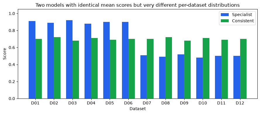
The above chart illustrates this difference. While Specialist scores around 0.90 on six datasets and around 0.50 on the other six, Consistent sits near 0.70 across all twelve. The distributions are completely different, but the mean is identical.
pd.DataFrame({
    "Model": ["Specialist", "Consistent"],
    "Mean score": [round(specialist_scores.mean(), 3),
                   round(consistent_scores.mean(), 3)],
}).set_index("Model")
| Mean score | |
|---|---|
| Model | |
| Specialist | 0.7 |
| Consistent | 0.7 |
2. Win Rate: a Better Scalar, Still Incomplete#
Win rate is the fraction of datasets on which a model scores highest.
scores_matrix = np.array([specialist_scores, consistent_scores])  # (2, 12)
win_rate = (scores_matrix == scores_matrix.max(axis=0)).mean(axis=1)

for name, wr in zip(["Specialist", "Consistent"], win_rate):
    print(f"{name}: win rate = {wr:.2f}")
Specialist: win rate = 0.50
Consistent: win rate = 0.50
fig, ax = plt.subplots(figsize=(6, 2.5))
ax.barh(["Consistent", "Specialist"], [win_rate[1], win_rate[0]],
        color=[palette["Consistent"], palette["Specialist"]])
ax.set_xlim(0, 1)
ax.set_xlabel("Win rate")
ax.set_title("Win rate is also tied at 0.50 — still no separation between the models")
ax.axvline(0.5, color="#9CA3AF", linestyle="--", linewidth=0.8)
plt.tight_layout()
plt.show()
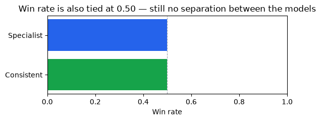
Win rate is also tied at 0.50. The six datasets where Specialist scores around 0.50 are exactly the six where Consistent scores 0.70, so Consistent wins those outright and Specialist wins the other six. Mean score and win rate give the same result.
Win rate offers a different angle on the same data: rather than averaging scores, it counts how often a model leads. But it remains a single number and does not capture how far a model falls behind on the datasets it doesn’t win. A model that loses by 0.001 and one that loses by 0.40 have identical win rates.
3. Performance Profiles: the Curve Behind the Number#
The key idea#
Performance profiles answer the following question: for a given tolerance τ, what fraction of datasets does a model solve within that tolerance of the best score?
At τ = 1.0, only the outright winner on each dataset gets credit, which is win rate exactly. At τ = 1.2, any model within 20% of the best score also counts. As τ grows, more datasets enter each model’s tally and the curve rises. A model that is always close to the best accumulates datasets quickly and reaches 100% at a small τ. A model that falls far behind on some datasets stays flat for a long stretch before those datasets finally come within tolerance.
The ratio and the curve#
For each model on each dataset, compute a performance ratio, the distance from the best score on that dataset:
Here \(s_{kj}\) is the score of model \(k\) on dataset \(j\), and the maximum runs over all models in the comparison. The ratio is always ≥ 1: it equals 1 exactly when the model achieves the best score on that dataset, and grows larger the further behind it falls.
The performance profile \(\rho_i(\tau)\) is the fraction of datasets where model \(i\)’s ratio is at most \(\tau\):
This is the empirical CDF of the ratios across datasets. At \(\tau = 1\), only datasets where the model achieves the best score contribute, so \(\rho_i(1)\) equals win rate exactly.
Note
Two requirements for performance profiles:
All scores must be strictly positive. The ratio \(r_{ij} = \max_k s_{kj} / s_{ij}\) is undefined when \(s_{ij} = 0\).
All scores must be higher-is-better. For metrics where lower is better (e.g., RMSE), flip the ratio: \(r_{ij} = s_{ij} / \min_k s_{kj}\), where \(\min_k s_{kj}\) is the best (lowest) score. Pass
metric_direction={"dataset": "min"}toevaluma.load_csvto handle this automatically.
No normalization to [0, 1] is required: the ratio formula is scale-invariant.
Because evaluma enforces requirement 1 (strictly positive scores), every performance ratio \(r_{ij}\) is finite. This guarantees that every model’s curve reaches ρ = 1 at τ = τ_max, unlike the original Dolan-Moré setting where a solver failure produces an infinite ratio and the curve can asymptote below 1.
The log₁₀(τ) x-axis#
The x-axis is plotted as log₁₀(τ), not τ directly. At τ = 1 (win rate), log₁₀(1) = 0, the left edge of the plot. At τ = 10 (ten times the best score), log₁₀(10) = 1.
The log scale makes sense because the ratio measures a multiplicative gap. A model that scores 0.90 vs. a best of 0.95 has the same multiplicative gap as one scoring 0.45 vs. 0.475: both are within a factor of ≈1.056. A linear scale would compress close competitors while stretching models that lag badly. This convention follows Dolan & Moré (2002), extended by the AutoML Decathlon (Roberts et al., 2022) and ML-GYM (Batra et al., 2025).
Plotting the profiles#
def make_bench_from_arrays(model_scores: dict, datasets: list):
    """Build an evaluma Benchmark from {model: scores_array} and dataset names."""
    rows = [
        {"model": model, "dataset": d, "metric": "score", "score": float(s)}
        for model, scores in model_scores.items()
        for d, s in zip(datasets, scores)
    ]
    with tempfile.NamedTemporaryFile(suffix=".csv", delete=False, mode="w") as f:
        pd.DataFrame(rows).to_csv(f, index=False)
        path = f.name
    bench = evaluma.load_csv(
        path,
        model="model", dataset="dataset", metric="metric", score="score",
        norm_ref_low=0.0, norm_ref_high=1.0,
    )
    os.unlink(path)
    return bench
bench_intro = make_bench_from_arrays(
    {"Specialist": specialist_scores, "Consistent": consistent_scores},
    datasets,
)

result_intro = bench_intro.performance_profiles()
result_intro.plot(figsize=(7, 4))
plt.title("Consistent reaches ρ = 1 first despite equal win rate — it never falls far behind")
plt.tight_layout()
plt.show()
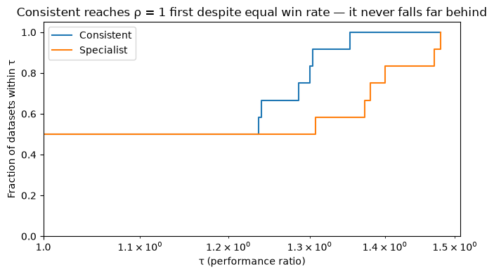
At τ = 1 (the left edge), both curves start at ρ = 0.50, confirming the tied win rate from Section 2. Consistent rises immediately and steeply, reaching ρ = 1 at log₁₀(τ) ≈ 0.13 (τ ≈ 1.35): on its six losing datasets it scores ≈0.70 against a best of ≈0.90, never more than ≈35% below the best. Specialist stays flat at ρ = 0.50 for a stretch and climbs more slowly, reaching ρ = 1 at log₁₀(τ) ≈ 0.17 (τ ≈ 1.48): on its six losing datasets it scores ≈0.50 against a best of ≈0.70, a ≈40% gap.
The shape of the curve reveals what no scalar can: Specialist has high peak performance on the tasks it excels at, while Consistent is never far behind on any of them. In a ranking table both models appear equivalent, but the profile makes the distinction immediate. Whether peak performance or broad competence matters more depends on what the benchmark is measuring and what you intend to conclude from it.
4. Reading the Profile — Three Common Patterns#
Three characteristic patterns appear repeatedly in practice. Recognising them lets you understand what kind of comparison you’re looking at before reaching for any single number.
dsets = [f"ds_{i:02d}" for i in range(1, 16)]

# 1. Dominant: one model above all others on every dataset
rng_dom = np.random.RandomState(42)
dom_scores = {
    "Dom-A": rng_dom.uniform(0.82, 0.96, 15),
    "Dom-B": rng_dom.uniform(0.42, 0.60, 15),
    "Dom-C": rng_dom.uniform(0.22, 0.40, 15),
}

# 2. Crossing: A wins more datasets outright; B is never far from the best
cross_scores = {
    "Cross-A": np.array([0.91, 0.90, 0.92, 0.89, 0.91, 0.88, 0.90, 0.93,
                          0.54, 0.52, 0.55, 0.53, 0.51, 0.54, 0.52]),
    "Cross-B": np.full(15, 0.74),
    "Cross-C": np.full(15, 0.38),
}

# 3. Clustered: all profiles nearly coincide — models are interchangeable
rng_clust = np.random.RandomState(13)
base = rng_clust.uniform(0.65, 0.75, 15)
clust_scores = {
    "Clust-A": np.clip(base + rng_clust.normal(0, 0.01, 15), 0.60, 0.80),
    "Clust-B": np.clip(base + rng_clust.normal(0, 0.01, 15), 0.60, 0.80),
    "Clust-C": np.clip(base + rng_clust.normal(0, 0.01, 15), 0.60, 0.80),
}

bench_dom   = make_bench_from_arrays(dom_scores,   dsets)
bench_cross = make_bench_from_arrays(cross_scores, dsets)
bench_clust = make_bench_from_arrays(clust_scores, dsets)

r_dom   = bench_dom.performance_profiles()
r_cross = bench_cross.performance_profiles()
r_clust = bench_clust.performance_profiles()
fig, axes = plt.subplots(1, 3, figsize=(14, 4), sharey=True)
titles = ["Dominant", "Crossing", "Clustered"]
results = [r_dom, r_cross, r_clust]

for ax, result, title in zip(axes, results, titles):
    result.plot(ax=ax)
    ax.set_title(title)

sub_a = r_cross.table[r_cross.table["model"] == "Cross-A"]
frac_a_at_1 = sub_a[sub_a["tau"] == 1.0]["fraction_within_tau"].values[0]
axes[1].annotate(
    "A wins more\ndatasets outright",
    xy=(1.0, frac_a_at_1), xytext=(1.3, 0.65),
    arrowprops=dict(arrowstyle="->", color="#374151"),
    fontsize=8, color="#374151",
)

plt.suptitle("Three common profile patterns", y=1.02)
plt.tight_layout()
plt.show()
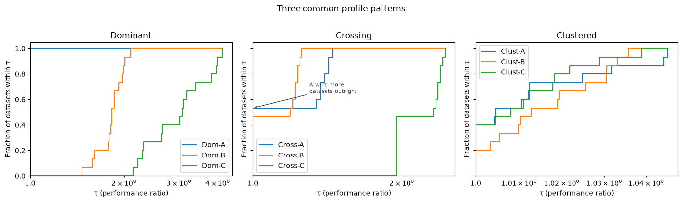
The dominant pattern (left panel) is the simplest: Dom-A’s curve starts high and reaches ρ = 1 well before the others. One model is better on every dataset.
The crossing pattern (centre panel) is more informative. Cross-A wins 8 of 15 datasets outright, so its curve starts higher at τ = 1. But its curve flattens after that, because on the 7 datasets it loses it scores around 0.52 against a best of 0.74, a ≈30% gap. Cross-B scores 0.74 everywhere, never wins outright but is always competitive; its curve rises steeply right after τ = 1, crosses A’s, and reaches ρ = 1 first. Cross-A has higher peak performance; Cross-B is more consistent across the full benchmark.
The clustered pattern (right panel) is also informative in its own way: all three curves nearly overlap, meaning the models perform similarly across all datasets and no clear winner emerges. When you see this pattern, the choice between models is unlikely to matter much for benchmark rankings.
Pattern |
What you see |
What it means |
|---|---|---|
Dominant |
One curve starts high and reaches ρ = 1 first |
One model is better on every dataset |
Crossing |
Curves start at different heights and cross |
Peak performance vs. consistency trade-off |
Clustered |
All curves nearly overlap |
Models perform similarly; no clear winner across datasets |
5. Caution: Profiles Depend on Who Is in the Comparison#
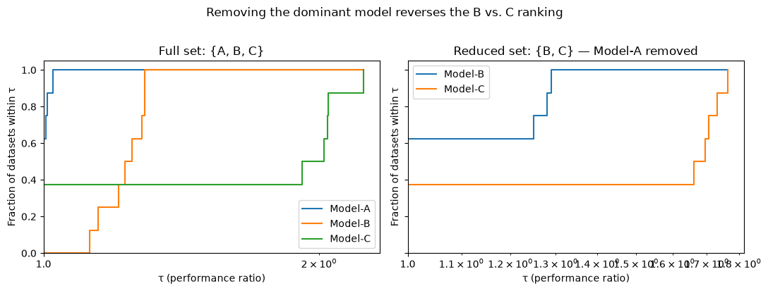
The performance ratio \(r_{ij} = \max_k s_{kj} / s_{ij}\) is defined relative to the best score across all models in the comparison. Remove a dominant model and that reference changes on each dataset, reshaping every other model’s ratios and potentially reversing the ranking.
The profile measures relative competitiveness, not absolute performance, so this is expected behaviour rather than a flaw. It does mean that conclusions about one model depend on which other models are included. Gould & Scott (2016) document this and recommend a stability check: drop the top-ranked model and confirm whether the remaining ordering holds.
We illustrate with three models on eight datasets.
datasets_8 = [f"D{i:02d}" for i in range(1, 9)]

rng_c = np.random.RandomState(3)
caution_scores = {
    "Model-A": rng_c.uniform(0.85, 0.95, 8),          # strongest overall
    "Model-B": rng_c.uniform(0.70, 0.80, 8),           # solid, always below A
    "Model-C": np.array([0.91, 0.93, 0.90,             # beats A on 3 datasets
                          0.44, 0.46, 0.42, 0.45, 0.43]),  # badly lags on 5
}

bench_caution = make_bench_from_arrays(caution_scores, datasets_8)
result_full   = bench_caution.performance_profiles()
bench_without_a = bench_caution.select_models(["Model-B", "Model-C"])
result_without_a = bench_without_a.performance_profiles()
fig, axes = plt.subplots(1, 2, figsize=(11, 4), sharey=True)

result_full.plot(ax=axes[0])
axes[0].set_title("Full set: {A, B, C}")

result_without_a.plot(ax=axes[1])
axes[1].set_title("Reduced set: {B, C} — Model-A removed")

plt.suptitle("Removing the dominant model reverses the B vs. C ranking",
             y=1.02)
plt.tight_layout()
plt.show()
def win_rates(bench):
    sc = bench._raw.values
    wr = (sc == sc.max(axis=0)).mean(axis=1)
    return dict(zip(bench._raw.index, wr.round(3)))

print("Full set win rates:", win_rates(bench_caution))
print()
print("Reduced {B,C} win rates:", win_rates(bench_without_a))
Full set win rates: {'Model-A': np.float64(0.625), 'Model-B': np.float64(0.0), 'Model-C': np.float64(0.375)}

Reduced {B,C} win rates: {'Model-B': np.float64(0.625), 'Model-C': np.float64(0.375)}
In the full set, Model-C occasionally beats the dominant Model-A on 3 of 8 datasets. By win rate the ordering is A > C > B, with Model-B appearing weakest because it never outright wins anything.
Removing Model-A changes the reference on five datasets where it was best. Model-B picks up those five wins and leads 5-to-3, and the relative ranking of B and C reverses from C > B to B > C purely because the benchmark lost its dominant model.
Warning
Run a stability check whenever you draw conclusions from profiles. Drop the top-ranked model and confirm whether the remaining ordering holds. If it reverses, report both views explicitly rather than treating either one as the definitive answer.
6. Applying Profiles to GeoBench#
The sections above built intuition on synthetic data. This section applies performance profiles to GeoBench, a geospatial remote sensing benchmark with 19 diverse datasets and 14 pretrained backbone models.
Loading the data#
import pandas as pd
import evaluma

df_raw = pd.read_csv("../../results_and_parameters.csv")

full_coverage = (
    df_raw.groupby("backbone")["dataset"]
    .nunique()
    .pipe(lambda s: s[s == 19].index)
    .tolist()
)
df = df_raw[df_raw["backbone"].isin(full_coverage)].copy()

bench = evaluma.load_df(
    df,
    model="backbone",
    dataset="dataset",
    metric="Metric",
    score="test metric",
    seed="Seed",
    norm_ref_low=0.0,
    norm_ref_high=1.0,
    metric_direction={"biomassters": "min"},
)
One dataset, biomassters, uses RMSE (lower is better). Passing metric_direction={"biomassters": "min"} tells performance_profiles() to compute the ratio as \(\text{RMSE}_i / \min_k \text{RMSE}_k\) so the model with the lowest RMSE still has ratio 1, and ratios grow as performance worsens. Performance profiles do not require normalizing scores to [0, 1]: the ratio formula is scale-invariant and operates on raw scores directly.
Selecting representative models#
Plotting all 14 profile curves at once produces an unreadable chart. A trimmed-mean aggregate ranking identifies the top performers; we then select one representative per model family. aggregate_ranking() serves here as a quick exploratory filter, not a definitive ranking.
agg = bench.aggregate_ranking()
agg.table
| model | score | |
|---|---|---|
| 0 | convnext_xlarge_fb_in22k | 0.538544 |
| 1 | convnext_large_fb_in22k | 0.535668 |
| 2 | dinov3_convnext_large | 0.534927 |
| 3 | dinov3_vitl16 | 0.533613 |
| 4 | terramind_v1_large | 0.526602 |
| 5 | clay_v1_base | 0.524408 |
| 6 | satlas_swin_b_sentinel2_si_ms | 0.523115 |
| 7 | dofa_large_patch16_224 | 0.517022 |
| 8 | satlas_swin_b_naip_si_rgb | 0.513132 |
| 9 | prithvi_eo_v2_600_tl | 0.512007 |
| 10 | terramind_v1_base | 0.502035 |
| 11 | prithvi_eo_v2_300_tl | 0.500841 |
| 12 | ssl4eos12_resnet50_sentinel2_all_decur | 0.473397 |
| 13 | resnet50 | 0.468763 |
top_models = [
    "convnext_xlarge_fb_in22k",   # top-ranked overall; ConvNeXt family
    "dinov3_convnext_large",       # DINOv3-pretrained ConvNeXt; different pretraining
    "dinov3_vitl16",               # DINOv3 ViT; different architecture
    "terramind_v1_large",          # Terramind foundation model
    "clay_v1_base",                # Clay geospatial foundation model
    "resnet50",                    # conventional ImageNet baseline
]

bench_top = bench.select_models(top_models)
Profile analysis#
result = bench_top.performance_profiles()
result.plot(figsize=(8, 5))
plt.title("Performance profiles — GeoBench top backbones")
plt.tight_layout()
plt.show()
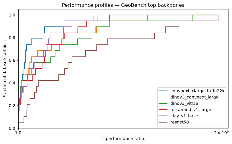
At the left edge (τ = 1), three backbones share a win rate of 0.21: convnext_xlarge_fb_in22k, dinov3_vitl16, and clay_v1_base each win outright on 4 of 19 datasets. terramind_v1_large and dinov3_convnext_large are close behind at 0.16, while resnet50 wins only 1 dataset outright.
The slope immediately after τ = 1 is where the curves diverge. convnext_xlarge rises steeply and reaches ρ = 0.5 at log₁₀(τ) ≈ 0.009; clay_v1_base and terramind_v1_large follow a similar trajectory and are the first to reach ρ = 1, at log₁₀(τ) ≈ 0.11 and 0.12 respectively. Despite tying on win rate, dinov3_vitl16 rises more slowly and does not reach ρ = 1 until log₁₀(τ) ≈ 0.26, meaning it lags substantially behind the best backbone on several datasets.
resnet50 shows the flattest profile: its curve barely moves until log₁₀(τ) ≈ 0.07 and does not reach ρ = 1 until log₁₀(τ) ≈ 0.30 (τ ≈ 2.0). This is the right-tail pattern from Section 4: a flat stretch followed by a slow climb signals datasets where the model lags badly relative to the best backbone.
Stability check#
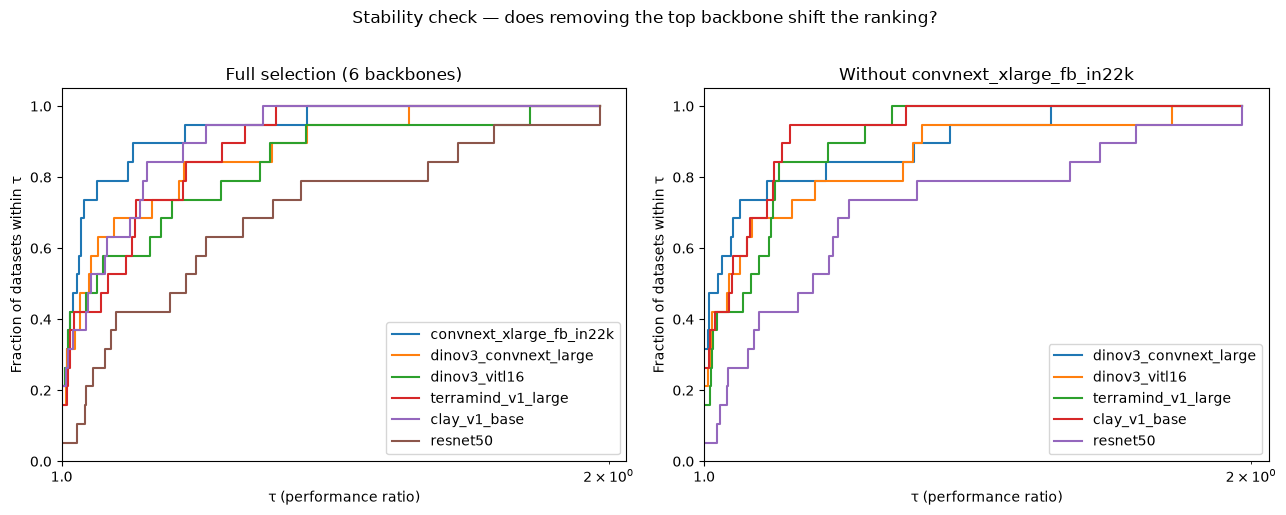
Following the caution in Section 5, we drop the top-ranked backbone and confirm whether the remaining ordering holds.
top_backbone = agg.table.iloc[0]["model"]
remaining = [m for m in top_models if m != top_backbone]

bench_no_top = bench_top.select_models(remaining)
result_no_top = bench_no_top.performance_profiles()

fig, axes = plt.subplots(1, 2, figsize=(13, 5))
result.plot(ax=axes[0])
axes[0].set_title(f"Full selection ({len(top_models)} backbones)")
result_no_top.plot(ax=axes[1])
axes[1].set_title(f"Without {top_backbone}")
plt.suptitle("Stability check — does removing the top backbone shift the ranking?",
             y=1.02)
plt.tight_layout()
plt.show()
def profile_order(result):
    """Return models sorted by win rate (fraction at tau=1), descending."""
    at_1 = result.table[result.table["tau"] == 1.0].copy()
    return at_1.sort_values("fraction_within_tau", ascending=False)["model"].tolist()

print("Full selection order (by win rate):")
print(profile_order(result))

print(f"\nOrder after removing {top_backbone}:")
print(profile_order(result_no_top))
Full selection order (by win rate):
['convnext_xlarge_fb_in22k', 'dinov3_vitl16', 'clay_v1_base', 'dinov3_convnext_large', 'terramind_v1_large', 'resnet50']

Order after removing convnext_xlarge_fb_in22k:
['dinov3_convnext_large', 'clay_v1_base', 'dinov3_vitl16', 'terramind_v1_large', 'resnet50']
If the relative order among the remaining models is unchanged, the profiles are stable. If any pair flips, note the instability explicitly in any report: the top backbone was suppressing ratios on datasets where it dominates, and its removal changes which model looks best on those tasks.
See also
For pairwise probability estimates of “which backbone genuinely outperforms another,” see the Bayesian comparison tutorial.
7. AUP: Collapsing the Curve to a Scalar#
A profile curve offers a more complete and nuanced picture of model performance than aggregate rankings, capturing both peak performance and consistency across the full tolerance range. When a single scalar is needed for a results table or to rank ablations, the Area Under the Profile (AUP), introduced by Roberts et al. (2022) in the AutoML Decathlon and subsequently adopted by AlgoPerf (Dahl et al., 2023) and ML-GYM (Batra et al., 2025), provides one by integrating the step function over log₁₀(τ) space:
Each term in the sum is the width of a step in log scale times the height of the profile curve at that step: it is the area enclosed between the curve and the x-axis. A model whose curve rises early and stays high accumulates more area than one that starts high but flattens.
Warning
AUP is not normalized. Its scale depends on τ_max, the largest ratio observed in the run, set by the worst model on the hardest dataset. AUP values are comparable within a single benchmark run but not across runs with different τ_max values. A model’s AUP will appear lower in a more competitive field simply because τ_max is smaller and there is less area to accumulate.
Use AUP as a quick ranking scalar; use the profile curve to understand why a model ranks where it does.
aup = result.aup
aup.sort_values(ascending=False)
convnext_xlarge_fb_in22k    0.276624
clay_v1_base                0.267863
terramind_v1_large          0.260853
dinov3_convnext_large       0.257178
dinov3_vitl16               0.246673
resnet50                    0.205700
dtype: float64
fig, axes = plt.subplots(1, 2, figsize=(12, 4))

result.plot(ax=axes[0])
axes[0].set_title("Performance profiles")

aup_sorted = aup.sort_values(ascending=False)
axes[1].barh(aup_sorted.index[::-1], aup_sorted.values[::-1],
             color=[f"C{i}" for i in range(len(aup_sorted))])
axes[1].set_xlabel("AUP")
axes[1].set_title("AUP ranks models by total area under their curve")
plt.tight_layout()
plt.show()
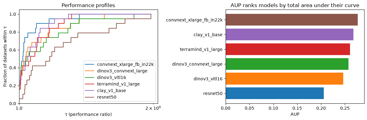
A model with high win rate but a long flat stretch afterward will score lower on AUP than you might expect: that flat region contributes no area beyond what the win rate already accumulated. The AUP ranking rewards models that are both competitive at τ = 1 and stay close to the best across the full τ range.
Summary#
Mean score and win rate both collapse per-dataset performance to a single number. Mean score assigns weight by score magnitude; win rate counts how often a model leads. Neither captures how far a model falls behind on the datasets it doesn’t win.
Performance profiles generalise win rate to all tolerance thresholds, tracing how quickly each model accumulates datasets as τ relaxes. Three patterns appear repeatedly: Dominant (one curve starts high and reaches ρ = 1 first), Crossing (curves start at different heights and cross, revealing a peak-vs-consistency trade-off), and Clustered (curves nearly overlap, meaning no clear winner emerges).
Profiles measure relative competitiveness, so adding or removing a model reshapes every other model’s ratios. Always run a stability check by dropping the top-ranked model and confirming the remaining ordering holds. AUP collapses the curve to a scalar useful for ranking tables, but is not comparable across benchmarks with different τ_max values.
References
Dolan, E. D., & Moré, J. J. (2002). Benchmarking optimization software with performance profiles. Mathematical Programming, 91(2), 201–213.
Gould, N. I. M., & Scott, J. (2016). A note on performance profiles for benchmarking software. ACM Transactions on Mathematical Software, 43(2), Article 15.
Roberts et al. (2022). AutoML Decathlon: Diverse Applications and Hard Metafeatures. NeurIPS 2022 Competitions Track.
Dahl et al. (2023). Benchmarking Neural Network Training Algorithms. arXiv:2306.07179.
Batra et al. (2025). ML-GYM: A New Framework for Benchmarking Reinforcement Learning in Scientific Domains. arXiv:2502.14499.